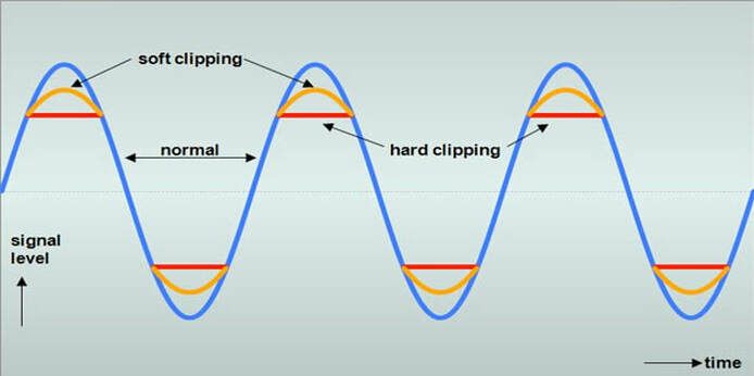
*An example of audio clipping.* (Source)
Approach:
This week I fell a little behind in my proposed progress due to some complications with my mental health. But, I did come to some realizations about how to prevent this patch from becoming too loud when having visual playback incorporated into the output. I'm beginning to understand the complexities of having too many objects on screen and how this would interfere with the digital-to-audio playback of the patch. Choices Made: The image above shows an example of how sound can be clipped during playback if the amplitude is too high with a set frequency. We can see that there are ways to have the sound become less clipped by increasing the threshold of the amplitude waveform, but this would ultimately lead to an issue where the actual hardware wouldn't be able to decode the waveform being fed into it. In sound synthesis, a basic way to consider how an amplitude envelope works is to consider it as a factor of 1 to 0. In this sense, 1 is full amplitude, while 0 is presumably "off". Something I have now considered (which my patch already does) is to have it recognize how many different shapes there are on the screen, and how large these shapes are in terms of pixel density (which my patch also does too!). When this is read, I can have the actual patch distribute the amplitude accordingly to each object. So, two objects would each have a (0.5) amplitude among them, 3 would have (0.33), 4 is (0.25), and so on. This would be accomplished by using a [target $1] command to send a message to the frequency modulation index. I am considering throwing a subtract (-.001) onto the total amplitude as to prevent any sort of clipping in the playback, just in case the patch decides, in the order of how it reads the data, to accidentally play both at full amplitude first before "snapping" them to it's distributed amplitude. I may have to play around with how this is determined though, as it could lead to some issues and may need reworking. Through observing how I can distribute the amplitude correctly, I want to consider having the size play an influence in how much of the sound is distributed as well. Having them both evenly distributed is a good first step, but having size as a factor will also be something worth considering. A larger object could have (0.7) amplitude, while a smaller one could have (0.3). Considering this, and associating it with float values, it could even be distributed as (0.98) and (0.02) depending on the size relationship of each object. Inspirational Sources: I found a new source of audio-visual inspiration this week from an individual named Max Hattler. While his pieces are more influenced by pre-rendered visuals, he uses audio to adjust and modify the visuals presented. A significant visual aesthetic is the repeated imagery. I learned from taking Matt Lewis's "programming design concepts" that this is a repeated frame-rate 'draw' function that can be adjusted and simulated to shrink/grow in size.
I've considered taking into account that if i can get this patch to work in the way that I want to, is to have an audio adjustment afterwords and a feedback loop to create even more obscure and abstracted visuals/sound. Some of the visuals are to the beat of the song, while some appear to be independent.
Questions Raised & Needs:
Next steps: This coming week I want to get back on track with my progress and begin play-testing with some basic animations that I'll created for the sake of the audio output. I'm hoping that I'll find more time on top of my other courses to further my progress for my research. Taking 4 studio/lab courses as well as teaching has started to become more hectic than I anticipated, but finding ways to distribute time is also necessary. -Taylor Olsen 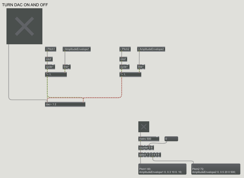 *A Max/MSP patch with the inputs of Frequency and Amplitude.* LINK TO PREVIOUS WORK Approach: For the beginning of this week, I decided to continue with my previous exploration path: the visual "Audio-izer" (link above). I want to use this as a continuation to my next phase of projects that include understanding the fundamentals of sound and visual synthesis, as well in finding new ways to explore animated loops. During my music synthesis class, we've been studying the basic physics of sound properties and how they're made; and much in relation to my field of study, this interests me greatly as I go through the same process--but there are many connections to be made between sound and visuals. Below you can find the PDF of my current proposal.
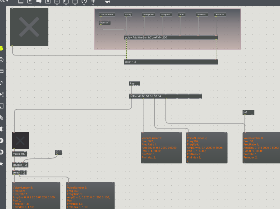 *A little more complex Max/MSP patch with the inputs of Amplitude Envelope, Frequency, Modulation, Ratio'd frequencies, and Frequency Modulation Indexes.* Choices Made: For this week I decided to return back to working with Max. I didn't get as far as I'd thought in my progress until realizing that understanding the basics of sound and how to produce it is exactly what was needed for my research. I've gained a better understanding of how sound waves are produced, and was left with a very basic and easy to understand reference found through online resources: What is Sound? 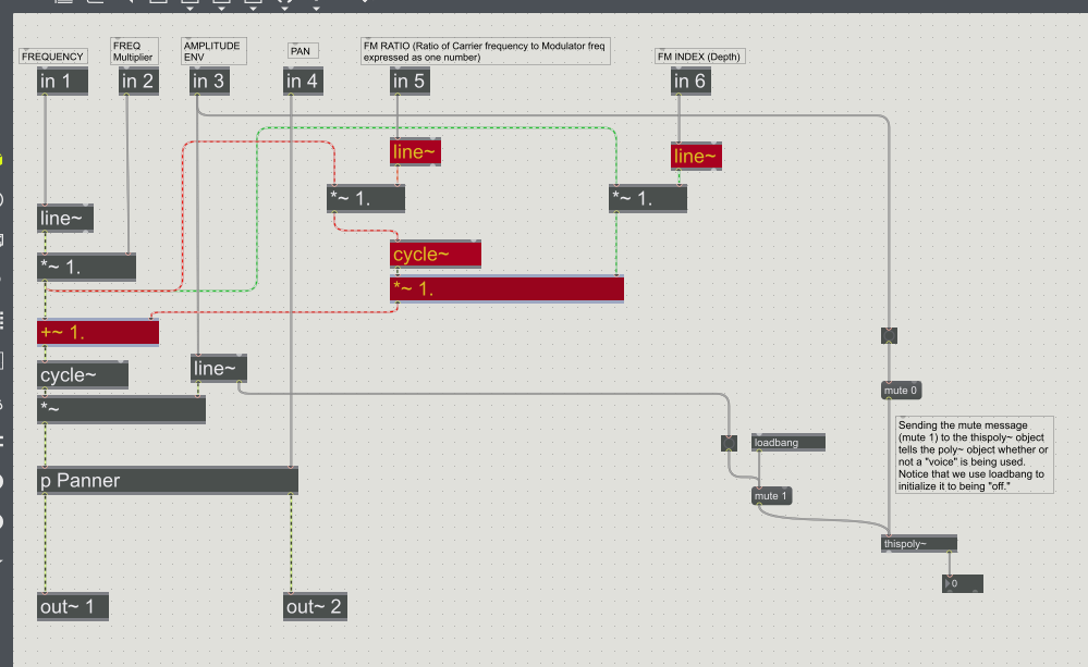 *An internal patch (referred to in this case as associated with a "poly" patch) used in the creation of the sounds for the previous image shown. Basically the inner workings of a patch, almost looks like a circuit board in my mind.* Inspirational Sources:
For this week I found an online post of a group who experimented with the synthesis of visuals and sound. I found one very interesting correlation between how they were using sound to drive the visuals: Audio Visual Synthesis "After playing with AV in many ways for some years we have concluded that the relationships between Audio and Visual streams are plastic, ie. not fixed. So in AVS there is no absolute correct mapping for e.g. colour frequency to sound frequency. The mappings can be set as required, creating relationships. Some relationships work better than others. As in real life relationships, using intuition and trial and error we (sometimes) home in on the ones that work best… " I think this quote is very important as I was never sure how I would implement what color was created by what sound. There's also the consideration of what I've began to elaborate more on: the relationship between sound and visuals is always inevitable because in simplest terms, they're both made out of wave-forms. In this sense both can have extracted values of color-to-sound that would be multiples of the frequencies presented (I would have to calculate the math, but something to consider). Questions Raised & Needs:
This next week I'll be testing these ideas as stated before for the determination of sounds. I also want to explore different ways of making the patch more CPU efficient. I should also play around more with MIRA on an Ipad to see how I can use it as an interactive device. -Taylor Olsen
Approach:
This week I presented the final short for the screening! I think that it went well, I appreciated the comments received from other professors and my peers. Mainly what I wanted to explore this week is making the minor edits to the short for the sake of realism, and nail down the sound and visual transitions near the beginning. I wanted to make a nice transition from the outside to the inside, and find a way to introduce the title text as well. I didn't want to name the piece after an aspect of light, but the feeling of waiting for the light to stop. In this case: "Cease". 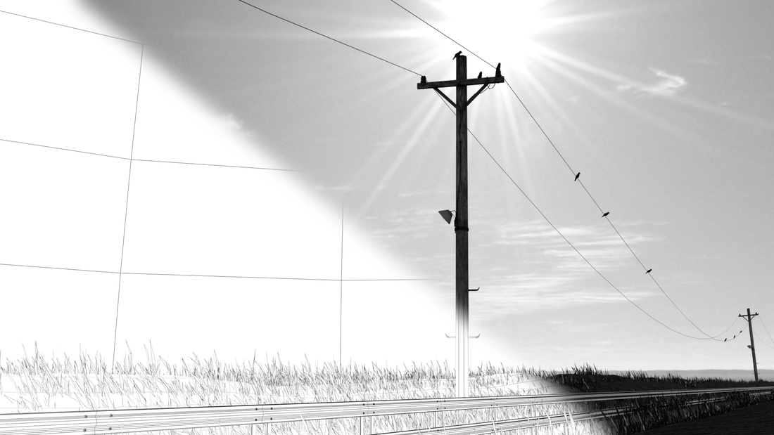
*A process shot showing the wire-frame vs. a final render.*
Choices Made:
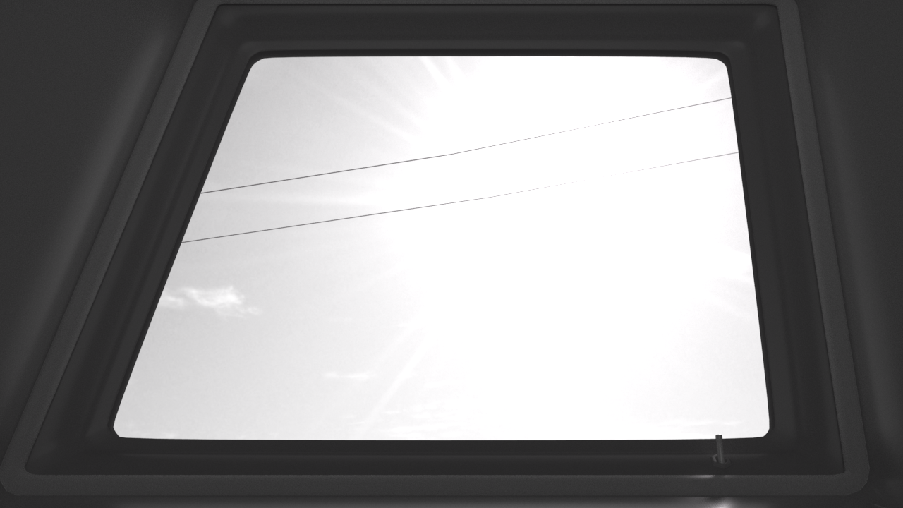
For the final pieces of the scene, I went into post and added some effects that I thought were necessary. I first used a motion tracking effect on the window so I could either create an adjustment layer for the outside or inside of the window. I went onto doing some slight color grading on the inside to pull out the highlights and shadows a bit more. The render of the interior of the car appeared to darken the light that I had placed on the inside; though I think that this is attributed to the atmospheric fog I added to the lighting of the scene. Next step from masking the area, I added a slight grain, glow, and contrast adjustment to window mask. This made the poles really pop out against the grey-skied background and the shadows cast from the blocked sunlight. There is also a smudged window layer assigned as an overlay. It's very subtle, and might not be necessary, but I wanted to at least attempt the effect. For the last touch I added a slight silhouette and a blur to the outside edges of the screen.
Next steps: This week I'll re-watch my short and make some small edits that I've noticed through repeatedly viewing it. I know I want to change the introductory typography, and have the ending credits come up a while later after letting the screen fade to black. I had the feeling that I didn't give the audience enough time to realize for themselves that the short is complete (I jumped into the text too quickly). -Taylor Olsen
*Introductory lighting test for the short's creation.*
Approach:
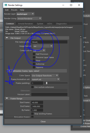
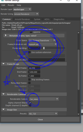
This week included creating a few different assets for the final short regarding the intro and some small embellishments to the Maya scene before I sent it off to render. My approach for the most part was making sure that everything fit together, my renders came out correctly (wow, I HATE rendering) and that my introduction fit into the scope of the project enough that it would transition smoothly. Above you can see the introduction; although it's about 25 sec. long, I'll end up cutting it about halfway through to make sure it doesn't drag on. Choices Made: I made my own choice, and mistake, to not give my rendered frames a prefix. UGH. So, as it would turn out my incremental saving was my partial downfall in the first round of renders. I had my scene names "EnviroLayout_4", BUT because I didn't put a set prefix, having the 4 at the end meant that every frame had a '4' in it's frame order, and all of them were incorrectly labeled and the animation sequence is basically unusable. Thankfully, the rendered frames look great and I was able to at least be happy with how they turned out. Now back to another 4 hours of rendering! Oh joy. Something to note: I found out that there is a similar command to consolidate files in After Effects; in Maya, going to File > Archive Scene will grab every file/texture/asset that's being used in the scene and put it all into one folder. EXTREMELY handy if you need to pass of your project to other people, I can't believe that I didn't know about this earlier.
*Don't make the same mistakes I did! Make sure to set your project, name your files, pick your cameras, and PUT A PREFIX!*
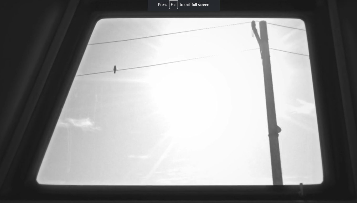
I also ended up going through and adding in some paint-effects in Maya for the grass on the side of the road. I wanted to have a little foliage for realism, and to cover up/fill any seams or "openings" that appear to be inadequately saturated with visuals. In addition to the foliage, I made the decision to also include birds on the power lines to give a little more discontinuity in the repetitive motion of the power lines.
*Time-lapse of the street creation. As well as small fixes to textures, and additional props for realism.*
For the sake of time as well in rendering, I decided that including the window in the frame and having to deal with transparency would make the render times shoot up. I'll include it in post later, since (thankfully) I decided to put the camera shake in post as well. I can create a mask in After Effects that will encompass the window, and play around with some transparency of a scratched/smudged window. While simultaneously using this mask as a template, I'm considering also adding in my own light leaks and playing with the grading of the grey-scale for the interior of the car, as there are a few areas that I'd like to be darker than they appear currently. I enjoy the blown-out look of the sun though, as it makes it feel more genuine in my opinion (since, generally, glancing at the sun tends to look over-exposed in any situation).
*A basic still from the short that I'll be compiling. No edits have been made to it yet.*
Inspirational Sources:
A trailer that inspired me (though I would love to see the film) is from a movie called "Roma". My professor initially suggested it to me and I hadn't gotten around to seeing it until this week. I really enjoy the wide panning shots that the director uses in the trailer, as well as the tracking shots and an intimate moment where it appears the main character is smiling at the camera. What's also very enjoyable in my opinion is that there isn't ANY narration in the trailer. I find it very effective the amount of wide shot's that are also incorporated, it gives a scope of the story at hand rather than arbitrary close-ups of faces and interactions.
*Netflix trailer for "Roma".*
Questions Raised & Needs:
Next steps: This coming week will including compiling my shots together (once the render finishes again), and doing some post work for making it look even more appealing than I already find it. I will also have to determine how I want the melody of sounds to work in the piece, as the Max/MSP patch that I created isn't capable of outputting a sound file that is read-able. I'm excited to see how it all works out in the end as I feel like I've made good use of my time, and pushed the scope of the project up towards the edge of what I can handle. In the end, this makes me realize how my productivity should be about finding more solutions that make me "work smarter, not harder". -Taylor Olsen |
||||||||